

Today, I am SO thrilled to be hosting a guest blog from Falling For You author Lisa Schroeder, as part of her official blog tour. I adore Lisa and all her books — and Falling For You is no exception. If you haven’t checked out this amazing new book, do so immediately — it’s already in stores!
Plus, check out other stops on the Falling For Youblog tour and enter here to win signed copies of Lisa’s YA titles.
* * *
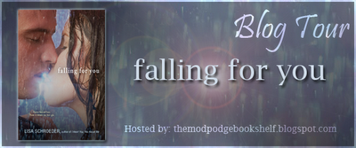
 Because Falling For You has lots of different elements to it, there were many ways the publisher could have gone with the cover. There’s a strong theme of darkness and light so I thought they’d probably play with that somehow. Because Rae works in a flower shop, I thought they might do something with with flowers, and I heard they tried, but nothing stood out enough. In the end, they decided to go with an image that almost looks like a movie poster and one that pushes the romantic elements of the book.Will it cause teens to pick it up? I hope so! Only time will tell. I do worry a little that some will be turned off by the hot and sexy cover, thinking it’s strictly a romance, because there is a lot more to it than just romance. But I do understand that no cover is going to hit on all the elements of a book.
 I’ve come across a few covers lately that I just love, where the publisher is taking a bit of risk, I think, and I thought it would be fun to talk about how readers feel about doing something different.
Here is an upcoming YA novel titled BIRD by Crystal Chan. I love the image within the image, and how it feels like you’re looking at a piece of art. I wonder if it takes longer to design something like this? I would love to see more artistic types of covers like this.
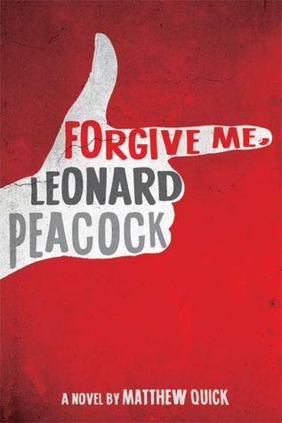 Or check out this one, FORGIVE ME, LEONARD PEACOCK by Matthew Quick, that doesn’t have much to it, really, but it says so much with so little. I like the simplicity of it, but I’m curious – what do teens think of something like this? John Greens THE FAULT IN OUR STARS was a pretty simple cover and that book has done all right.
 And this one, ELEANOR & PARK by Rainbow Rowell is also artistic and personally, I would love to see more drawn covers like this one. I think it’s fun and different and really stands out in the sea of darker covers that always seems to dominate the shelves.
So tell me, readers, am I alone in liking these different and artistic types of covers? What kind of covers do YOU like? I’m also curious how much of a role the cover plays in you purchasing a book.

I have not read any of Lisa’s books before but I want to. I would love to read Falling For You. It sounds really good. I want to read Shades of Earth also. There are so many books on my list.
You’re not alone. I like all different types of covers. Sometimes you just need to get away from humans on the cover. Covers do not influence my buying a book. I like them but the content is so much more important to me. Thank you and have a great tour :).
I know you aren’t suppose to judge a book by its cover, but I am guilty of doing so – and the title. A bad title with a good cover, or a good cover with a bad title will make me think twice. I think the two go hand in hand. The falling for you cover makes me want to pick it up, but I do love a good romance. I also like a pretty dress on the cover. I might dismiss a book at first because of a cover, but then if I see some good reviews for it and I’ll give it another shot. But then again I’ve also seen great covers that have had terrible stories inside.
The cover makes the first impression and if it’s not a good one then I’m more likely to rely on the reviews before I think about buying. If I like the cover and the blurb I’ll buy it without the reviews.
FALLING FOR YOU looks great, and I love the other covers you shared as well! I’ve been studying YA covers for a while and have begun to gravitate toward the lighter, more artsy (if that’s a proper description) covers lately, too! (The more subtle the colors and vintage they look, the more I want them!) I personally love FALLING FOR YOU, because it’s a close-up. 😉 (Still loving the close-ups!)
I’m sure it’s always exciting to see what the publishers come up with for the covers. The flowers/flower shop cover probably wouldn’t have stood out on the shelf as much as this one, and though I’m a (teeny) bit older than a teenager, I’d say this is definitely going to be one they (and us older ladies) grab on to! 🙂
(I also always find it interesting to see books that start out as hardcovers and then come out as paperbacks… many times the covers are so different from the originals!)
Jessica 🙂